Leading, Line Spacing, and Tracking in Typography
Typography plays a crucial role in how your content is perceived. Three important elements of typography that are often overlooked are leading, line spacing, and tracking. Below, I’ll discuss the difference between these and how they affect the readability of your content.
Leading
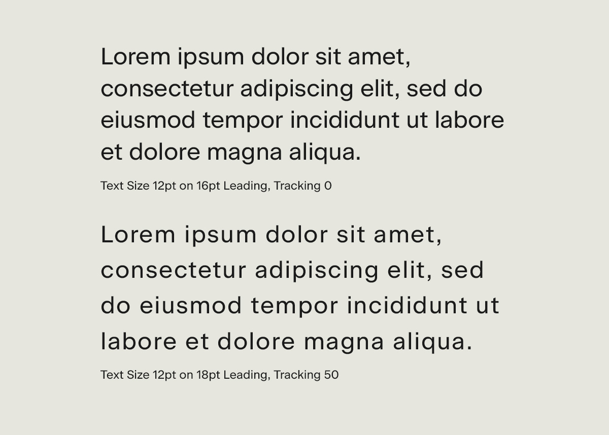
Leading, also known as line spacing, refers to the amount of space between lines of text. The term comes from the days of manual typesetting, when strips of lead were used to separate lines of type. In digital design, leading is measured in points or pixels.
The general rule of thumb is to use a leading that is slightly larger than the font size. For example, if you are using a 12-point font, a 14-point leading would be appropriate. This allows for enough space between lines of text to make the content easy to read, without creating too much white space.
Line Spacing
Line spacing, also known as leading, refers to the amount of space between lines of text. It is measured in points or pixels and is often set as a multiple of the font size. For example, a line spacing of 1.5 would mean that there is 1.5 times the font size between each line of text.
Line spacing can have a big impact on readability. Too little line spacing can make text feel cramped and difficult to read, while too much line spacing can make text feel disconnected and hard to follow. A good rule of thumb is to use a line spacing that is slightly larger than the font size.
Tracking
Tracking, also known as letter spacing, refers to the amount of space between letters. It is measured in points or pixels and is often set as a positive or negative value. A positive value increases the space between letters, while a negative value decreases it.
Tracking can be used to adjust the overall spacing of a block of text, making it tighter or looser. It can also be used to fix spacing issues between specific letters, such as when two letters appear too close together or too far apart.
Leading, line spacing, and tracking are all important elements of typography that can greatly affect the readability of your content. By understanding the difference between these three elements and how to use them effectively, you can create documents and websites that are easy to read and visually pleasing.