Ford Pipe Organ Builders
New brand identity for Ford Pipe Organ Builders
Ford Pipe Organ Builders is a new, Sydney-based business — with more than 30 years experience in its field — building new bespoke pipe organs, restoring instruments from the late 19th and early 20th century, relocating instruments and performing electrical control system upgrades and replacements of instruments.
I was delighted when Rodney approached me for a new brand. For those of you who don’t know, my husband James is an organist, so pipe organs are something I’ve become quite familiar with over the years. They are an incredibly complicated setup behind the scenes – there’s still so much I don’t know about the world of pipe organs and organ music.
So, to have the opportunity to learn more about the ‘king of instruments’ from a builders’ perspective was fascinating.
Strategy and creative direction
During the discovery phase, it became clear that Rodney was a true craftsman—the way he spoke about his work was authentic, assured and quietly passionate. I learned that he has been practising his trade for more than 30 years, resulting in a skillset so polished that you can’t help but admire his profession and the beauty of the tradition behind it all.
Rodney showed me some of his technical drawings, and besides the incredible attention to the finer details, what struck me was the bespoke nature of his designs. Every single project is unique and tailored to the specific needs of the client, whether they are a private customer or an orchestra.


After completing my research, I worked on strategy, and presented a creative direction to help guide us through the design process. Some of the key works selected were clean, minimal, timeless, bespoke, modern and elegant.
The design process
My primary goal was to achieve a visual balance between two opposites—tradition and modernism.
Creating the Moodboard
In the moodboard, I was inspired by mid-century modern design and quality materials (leather, natural jute, bronze, timber), which evoke feelings of bespoke craftsmanship. To me, these felt familiar and warm. Then, to balance those with a modern and professional feel, we focused on clean and minimalist wordmarks as our inspiration for the logo type.
I shortlisted four main points of what I wanted to explore visually for the brand, and after presenting the moodboard, we confirmed together that this was the right direction for the new brand:
- Clean sans serif typography — In either geometric (one width in the letterforms based on geometric shapes) or Didone style (contrasting thick and thin widths in the letterforms) to portray a luxe style.
- Handcrafted abstract patterns — Using the design principles of repetition and rhythm to portray the intricate and precise design process and attention to detail, in an organic and approachable way.
- Client’s own technical drawings — An authentic and personal touch, showcasing Rodney’s professionalism and technical skills.
- Clean 2D symbolism inspired by Rodney’s work, or monogram-inspired shapes which are clean, timeless and professional.
Logo concept development
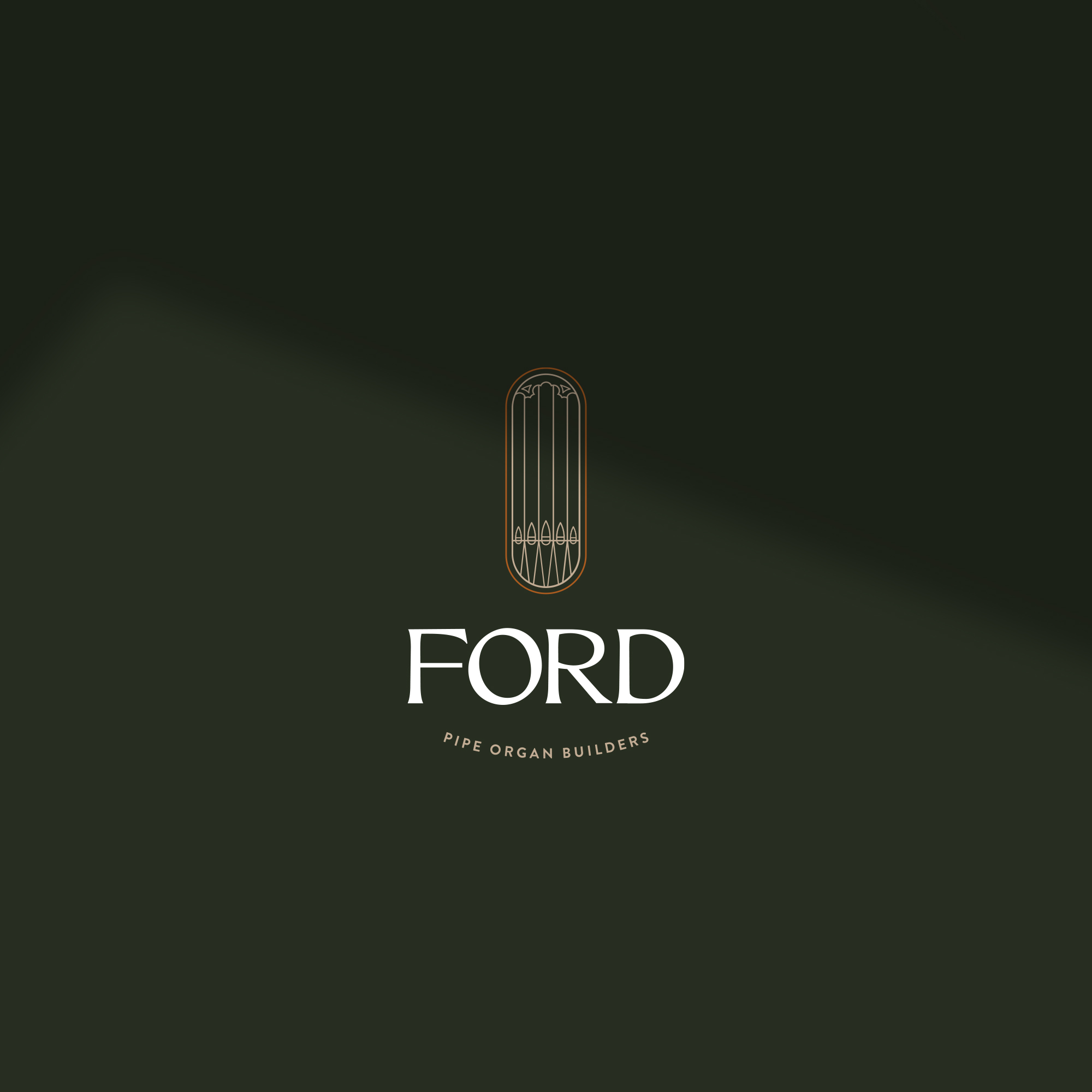
I dived straight into the creative process, where I enjoyed experimenting with the shape and form of pipes and ornamental casework, directly inspired by Rodney’s own work.
This attention ensured the brand would be infused with personal meaning as well as speaking effectively to incoming clients seeking that quality craftsmanship that is so elegantly portrayed in Rodney’s work.
Here are some preliminary concepts that formed during the experimental process:

Out of three logo concepts presented, two were in close contention for refinement and consideration, with the arched tagline a definite winner.
One of the creative decisions that was made as I listened carefully to feedback on the logo concepts, was to increase the vertical appearance of the symbols. This gave the logo a more stately and confident feel, which really enhanced the natural shape of the pipes. This is where the collaborative process shows its value—a fresh perspective often improves one of my ideas into something even better!
We also removed some of the finer ornamentation and thickened the stroke weight on the lines so that it would perform the best as a logo symbol (which needs to reproduce well at both small and large sizes).
Colour palette selection
The colour palette was inspired by the materials portrayed in the moodboard, which also took colour theory into account. We focused on colours that communicated growth, warmth, elegance and dependability.

As planned, I also created a brand pattern. A custom pattern is a great brand recognition tool to have in your suite to help strengthen top of mind awareness for your target audience.
I experimented with one similar to the image in the moodboard, but felt the straight lines were too much in competition with the pipes in the logo symbol, and the thicker lines clashed, which was a distracting.
Instead, I created a beautiful pattern that was rich in rhythm but lovely and loose in nature. It was designed to resemble the twists and organic forms of woodgrain, to reflect the materials used in organ building / the casework of the pipe organ, while also showcasing some more subtle, abstract elements: loose forms of people, representing strong client relationships, and abstract forms of pipes.

As the project came to a close, we developed a suite of branded collateral, including business cards, a letterhead, an A4 grid pad to use for sketching, and email signatures. I also prepared a comprehensive brand guidelines document which will serve as a roadmap for Rodney, guiding him and other staff on how to best apply the brand across new touch points as they are created, such as social media posts and advertising material.

I’m so pleased with how everything came together in the end, and now Ford Pipe Organ Builders has a distinctive brand identity to present to the world.
Working with Leysa was an amazing experience. From beginning to end, the whole design process was really a journey of discovery and appreciation of one’s abilities, with Leysa being both companion and guide. — Rodney Ford
Interested in developing a beautiful new brand for your business? Enquire now: [email protected]