Coralie Stow Design — Branding Process
Coralie Stow Design (website coming soon!) is an interior designer and fine arts specialist who works with clients interested in cultivating distinct and timeless spaces filled with a sense of tradition and joy. Coralie mixes old and new pieces, rich colour, pattern, and texture to create a personal expression of who they are through a liveable masterpiece.
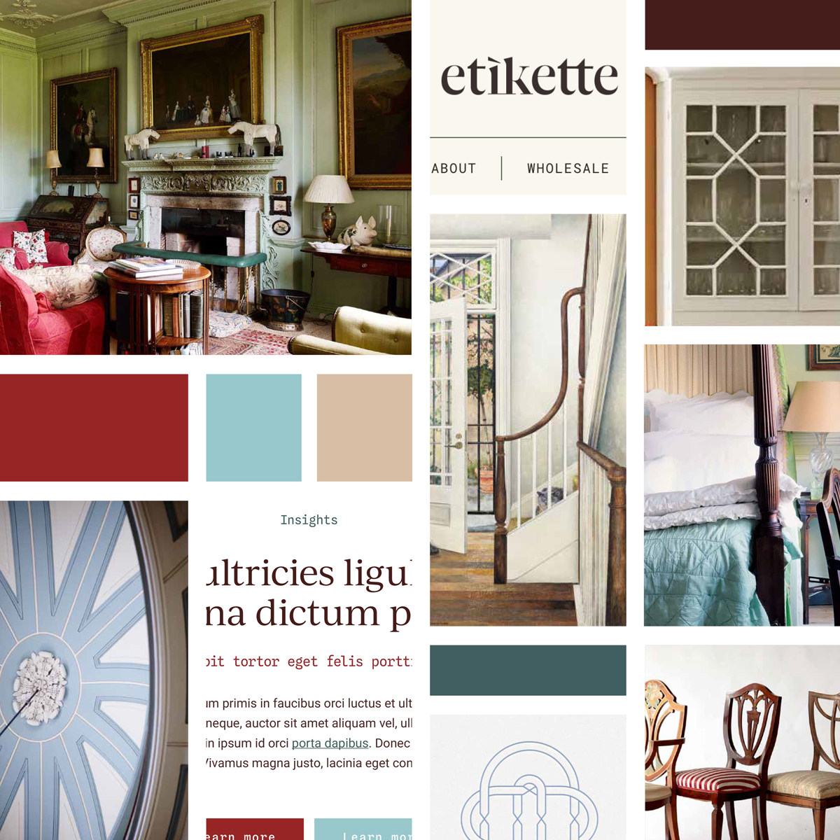
Creating this brand was a dream. I enjoyed working with inspiration from the Georgian and English Country House styles and art — including artworks from the current Cressida Campbell exhibition — to create a clean and elevated representation of Coralie’s brand.
Brand foundations + strategy
Firstly, we worked on developing a clear roadmap for the brand, including defining the brand’s vision, values and personality, before taking a close look at how her competitors were presenting themselves.
In this case, we discovered the following common themes about her competitors:
- Black and white — no colour in the branding at all
- Mostly uppercase typography in sans serif
- Lack of meaningful iconography or symbolism
Taking a moment to look at competitors is an important step because it helps us to identify any common themes that we can break away from, making the brand stand apart. It also helps us to identify areas where we can do better, be different, and take the lead.
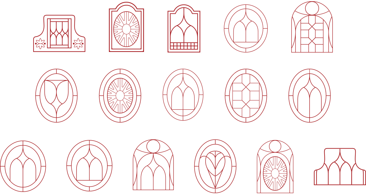
Logo mark
For the logo mark, we knew we wanted something with clean lines and symmetry that felt meaningful, inspiring and detailed. We drew inspiration from the shapes and lines in the dome of the neoclassical vestibule and the ceiling dome in saloon of the Georgian-style Elizabeth bay house in Sydney, as well as the shape of the bannister in Cressida Campbell’s Otto on the stairs, the chairs seen in Bedroom Nocturne and English Country bedrooms.
The patterns in the glass cabinet doors also conveyed a pleasing, symmetrical balance and felt traditional and confident, which we were drawn to. The backs of the chairs also felt very beautiful and detailed. These became the prominent source of inspiration as we refined the logo mark into a final version.
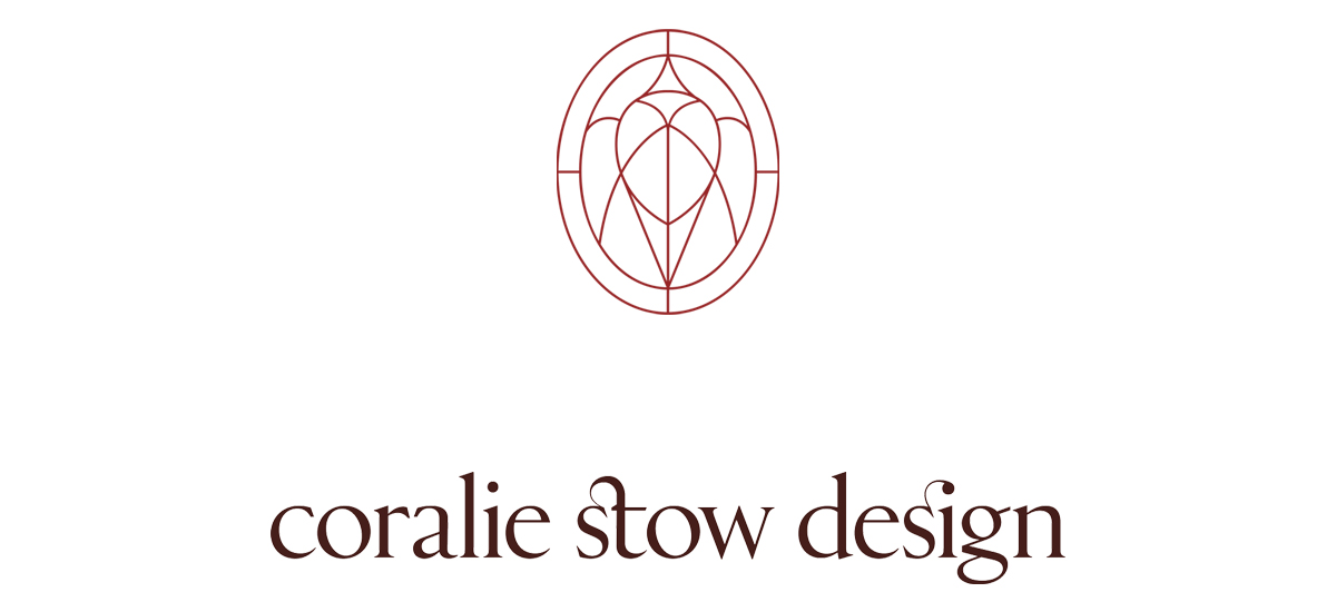
Wordmark logo
For the wordmark logo, we went with a ‘quietly sophisticated’ lowercase to stand apart from her competitors, who were all using uppercase. To further stand apart, we based our custom logo on a utilitarian serif typeface called Rizoma, which is a contemporary typographic interpretation of Roman inscription letters. It’s confident, elegant and unpretentious. This was then further customised into a unique logo.
I just loved the meaning of how the type was inspired by ancient Rome, but is modernised — much like how Coralie works with history and antiques in her work to create liveable masterpieces for present day living.
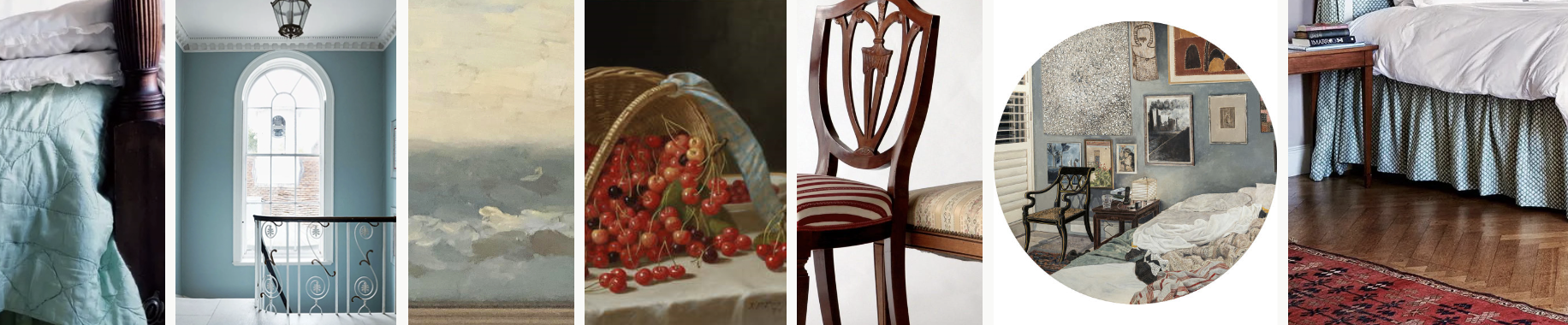
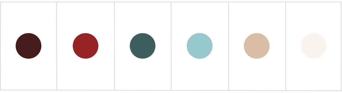
Colour palette
The colour palette was inspired by the bedding and the main staircase of Bradwell Lodge and an artwork owned by Coralie by Sybil Craig. The deep muted teal combined with the light blue are calming, sophisticated and feel artistic and inspiring.
A light blue is also seen in a painting of cherries by John Francis, along with the red and maroon, which adds depth and conveys passion, richness, warmth; it balances the blues with an injection of confidence and energy. The maroon is seen again in the Georgian revival chairs, along with a deep mahogany, a resilient colour, which feels traditional, classic and timeless. We then rounded out the palette with some neutrals.
This palette completely steered away from the black and white that her competitors were using and feels much more personalised and inviting.
Our goal
As you can see, I take quite a holistic and detailed approach when designing a brand identity! I’m passionate about storytelling with brand design.
The goal is for the audience to connect with a brand because they see their own values reflected in the brand identity (visual or tangible elements). As humans, we buy from brands with which we have an emotional bond. This is the authentic way to foster long-term brand loyalty that isn’t cheesy or salesy.
Instead, it helps to connect like-minded people together in a way where everyone wins — the brand serves their ideal customer in a way that is genuine and truly invested in their needs, and the customer has their problem solved or their needs met by the most ideal provider for them.
I hope you enjoyed this insight into my branding process! If you’re interested in exploring this process for your own business, you can explore my branding packages here or get in touch with me here.