4 considerations for selecting your brand colour palette

Selecting colours for your brand colour palette is (and should be) a little more complicated than simply choosing some colours that you like and work well together.
When I am selecting colours for my client’s brand colour palettes, I have four key considerations:
- Competitors’ brand colours
- Colour psychology and meaning
- Practical use
- Colour conversions
Let’s discuss these four points in more depth.
Your competitors’ brand colours
One of the main reasons to invest in branding is to distinguish your brand and make it memorable. I look at many factors in a competitor analysis, including what colours they are using. This gives us insight into how we can break away from what they’re doing and be different.
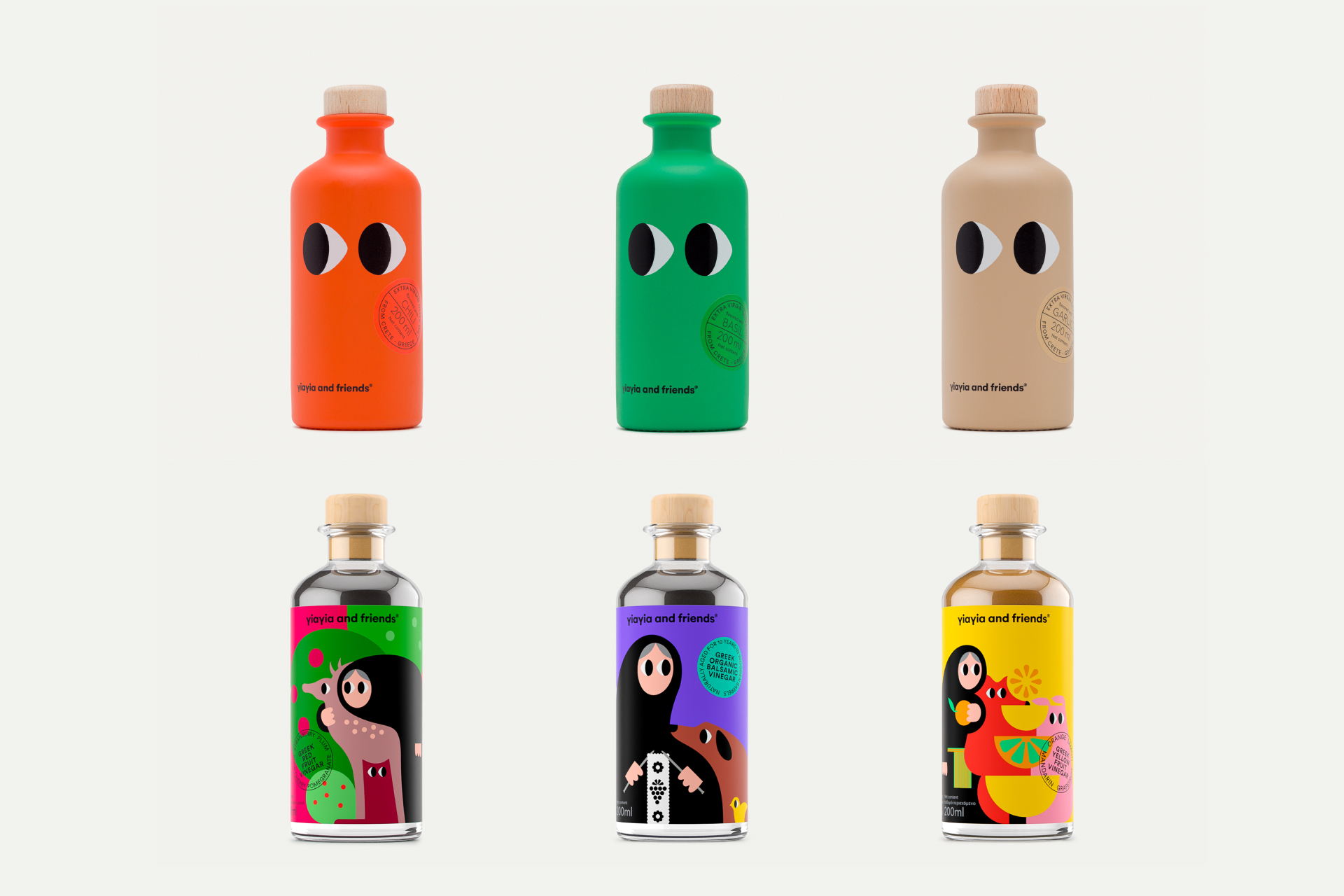
Consider this analogy: your standard olive oil aisle in the supermarket. Yup — pretty much all olive green colours, right? Think how impactful brand Yiayia And Friends (below) would look on this shelf! Not only the designs, but the colours are incredibly different and stand out.
Colour psychology and meaning
Of course, colour psychology plays a huge part in your brand colour palette. Orange feels creative and energetic, blue feels calm and professional, red feels bold and passionate, and so on. So I consider how we want the audience to feel and respond to the brand. How do we want the brand to be portrayed?
For example, we defined The Finer Detailer’s brand personality as specialist, clean, approachable, modern and professional. Going back to competitor analysis, we discovered a lot of use of black. Returning to colour psychology, black feels premium, sophisticated and high quality, which we certainly wanted to portray as part of their specialist attention to detail. But to stand apart, we went with a deep inky-teal colour, supported by brighter tones of blue, orange and yellow. Along with other design decisions we made, such as a hand-lettered wordmark logo, this ensured The Finer Detailer would not only stand out against their competitors, but still achieve that high quality, premium feel without using a straight black.


When we need to avoid certain colours, such as the ones your competitors are using, we also consider what we need to avoid due to colour psychology and meaning.
For example, I’m currently working on a branding project for an interior designer based in Brisbane, Queensland, Australia. We are avoiding green, due to its obvious reference to the tropics, which feels a little cliché, given the brand’s location, services and audience.
Practical use
Of course, there’s no point creating a colour palette that looks nice if it doesn’t work properly upon application.
I ensure I consider at least one darker colour for body copy, for example, a very light tone for background use, and 1-3 primary colours that really stand out and can be used for call-to-actions (CTAs), hyperlinks etc. There should be enough contrast across the entire palette for visual balance and versatility.
Overall, the colours within the palette should all be able to be easily used in different combinations and not clash or blend in with one another.
Colour conversions
Your brand colour palette will be used for both print and digital use and it’s important that they work well across different applications.
For print use, you might have business cards, gift certificates, packaging, stickers, promotional material, signage, etc. For digital use, you might have a website, social media profiles, social media graphics, email marketing, etc.
Each colour for your brand has a specific set of codes. These allow you to reproduce that exact colour for any situation.
It’s important that your brand colour palette will convert well between these codes — from CMYK (print use) to RGB (digital use) and to Pantone spot colour (also used for print).
Here’s a quick explanation of these different techniques:
RGB + Hex Code (#)
These types of colour codes are specifically meant for web or digital use. You’ll use these whenever you’re working on your website or creating a graphic for social media. In a program like Canva, for example, you can just paste in the HEX (#) Code.
For example, #000000 is black.
CMYK
CMYK is a printing method where Cyan, Magenta, Yellow and Black inks are mixed together to create your colours. You can use this for smaller print runs or when you want to keep printing costs low. Keep in mind that this can be less accurate than Pantone colours so always ask to review a printed proof first.
For example, C0 M0 Y0 K100 is black.
Pantone
Pantone is an ink company known for their precision colour matching. Their inks are used for when colour consistency is a priority. They are more costly than CMYK, but I always recommend to use Pantone spot colours where possible.
I won’t get into the technical details of colour spaces, but there are limitations to colour use. For example, some RGB colours that you can see on your computer screen are not able to be replicated using CMYK printing.
Here is a great infographic via Jukebox Print, showing how colours convert between methods.
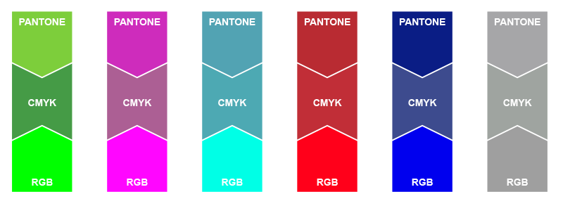
So, I always ensure the colours I choose for a brand colour palette will convert well between these three methods.
Pantone Connect is an invaluable tool that I use for this, and I prepare and cross-check all of my brand colour palettes with this tool.
For example, Pantone Black C is black.
In summary
Selecting colours for your brand colour palette has many important factors that you need to take into account, including your competitors’ colours, colour psychology and meaning, practical use and colour conversions. How well is your brand colour palette addressing these considerations?